Case study · Bakery branding · United Kingdom

Circles: Building a Warm, Memorable Brand for a UK Patisserie and Boulangerie

Circles is a UK patisserie, boulangerie and dessert brand. Mavens Strategies created its complete visual identity, from the bitten-circle logo and colour palette to packaging, uniforms, shopfront signage and interiors, so every touchpoint feels as good as the first bite.

Client
Circles
Industry
Patisserie, boulangerie & desserts
Market
United Kingdom
Scope
Logo, brand system, packaging, signage, uniforms
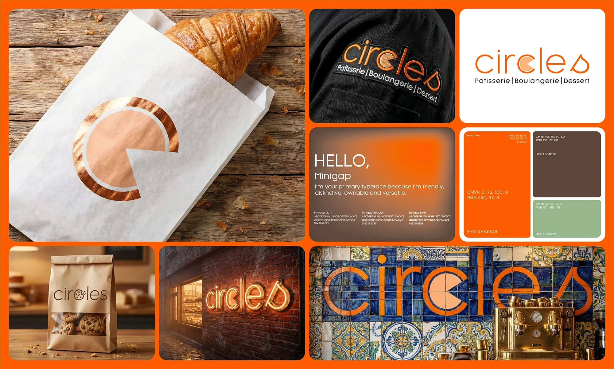
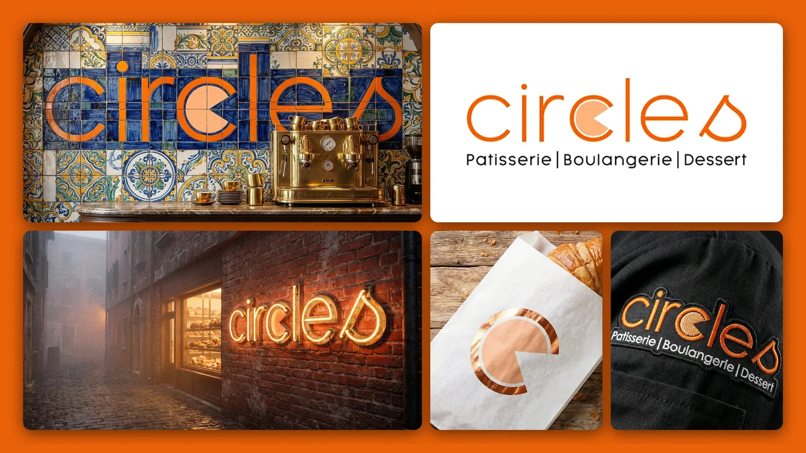
Circles patisserie brand identity: tile mural, neon sign, logo, copper-foil bag and chef patch
Client overview

A bakery that wanted to be remembered

Circles bakes French-style pastries, breads and desserts for customers in the UK. The team had the recipes and the passion, but needed a brand that matched the quality of what comes out of the oven and could stand out on a busy high street.

They asked Mavens Strategies to create a complete brand identity: a logo customers would recognise instantly, a clear system of colours and type, and designs for every place the brand appears, from paper bags and chef jackets to the shopfront and the café wall.

The challenge

Premium, playful and easy to recognise

UK bakeries compete with high-street chains, supermarket bakeries and independent cafés. Circles needed a brand that felt crafted and premium, yet warm and approachable. The identity had to:

  • Say “patisserie, boulangerie and dessert” clearly, without looking like every other French bakery.
  • Work at every size, from a small sticker on a pastry bag to a full-width shopfront sign.
  • Reproduce well in very different materials: foil, kraft paper, embroidery, neon and ceramic tile.
  • Give staff and suppliers simple rules so the brand stays consistent as the business grows.
Services we delivered

One idea, every touchpoint

01

Logo Design & Brand Mark

The idea is simple and edible: the “c” in Circles becomes a circle with a bite taken out of it, like a tart or a cookie fresh from the counter. The final “s” ends in a soft drop shape, a nod to cream, glaze and chocolate.

  • Custom wordmark with the bitten-circle “c”
  • Standalone bitten-circle icon for small spaces
  • Descriptor line: Patisserie | Boulangerie | Dessert
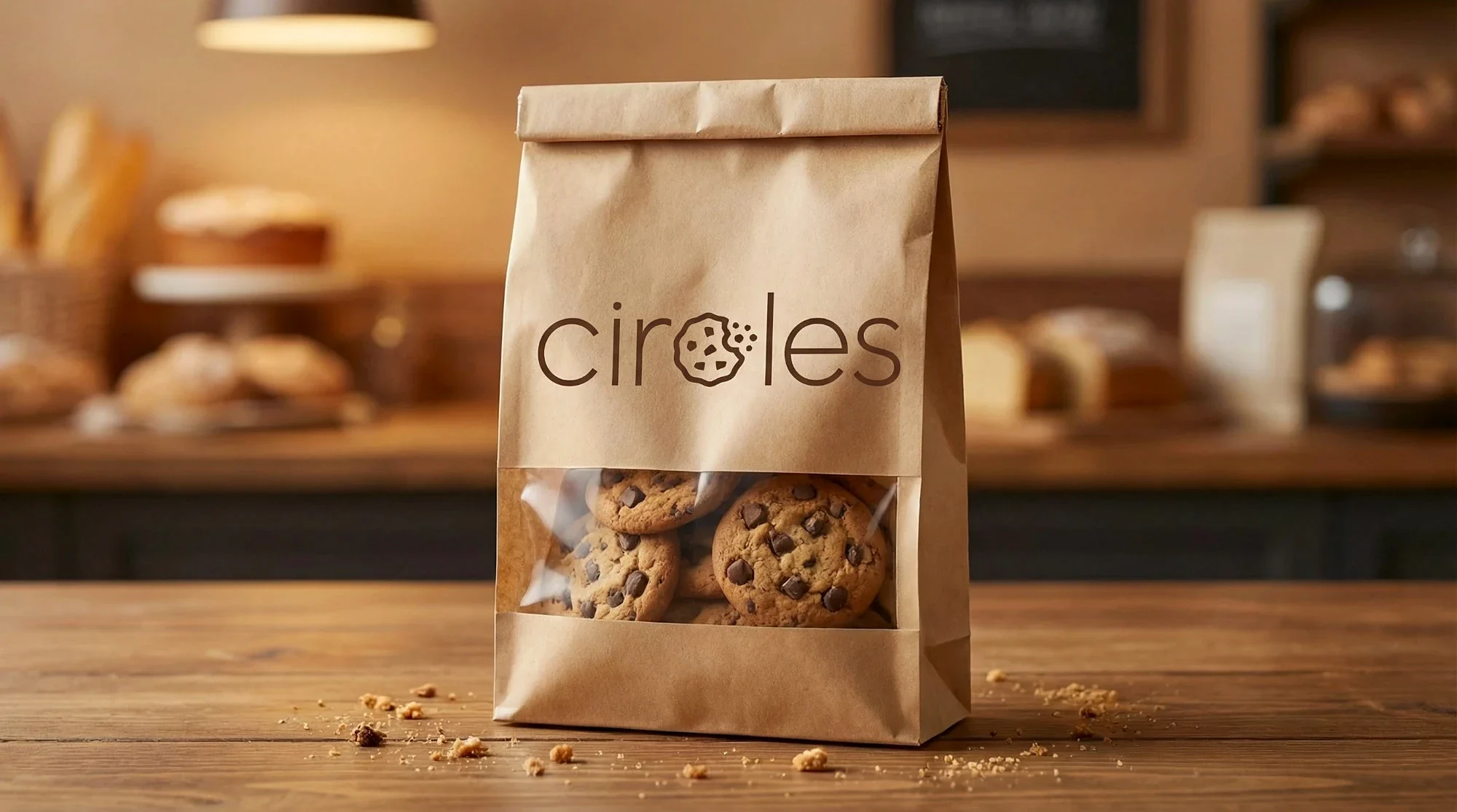
  • A playful product variant where a cookie becomes the “c”
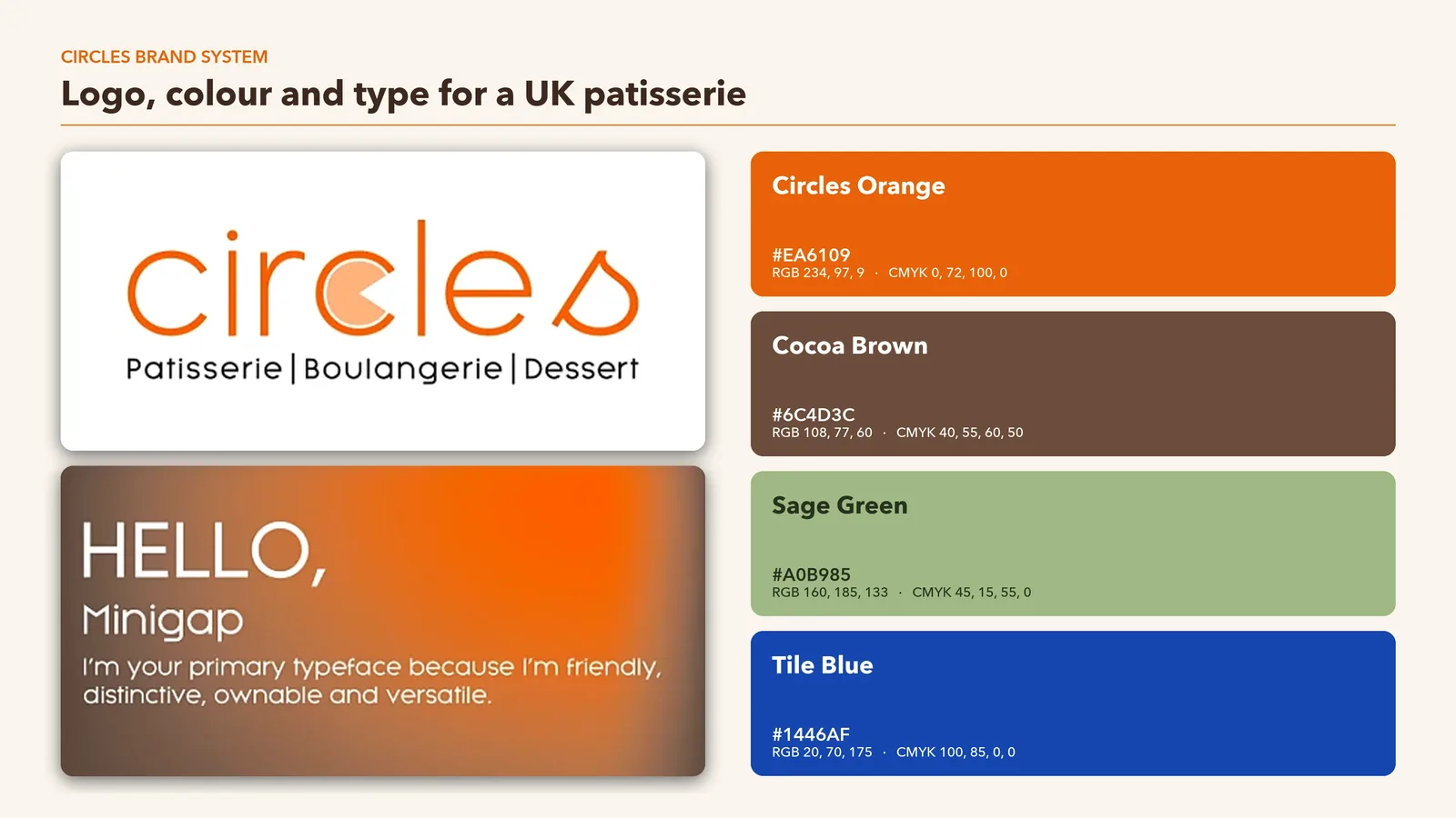
Circles brand system sheet with logo, Minigap typeface and orange, brown, sage and blue colour palette with HEX, RGB and CMYK values
02

Colour Palette & Typography

A warm, appetising palette led by Circles Orange, balanced by cocoa brown, fresh sage and a ceramic tile blue. The rounded Minigap typeface is friendly, distinctive and easy to read on menus and packaging.

  • Primary and secondary colours with HEX, RGB and CMYK values for screen and print
  • Minigap in light, regular and bold weights
  • Rules for text, headings and backgrounds

Circles colour palette

Orange#EA6109
Cocoa#6C4D3C
Sage#A0B985
Tile Blue#1446AF
03

Packaging Design

Packaging carries the brand out of the shop and into customers’ homes and social media feeds, so it had to look beautiful and feel premium in the hand.

  • White pastry bags with the bitten-circle mark in copper foil
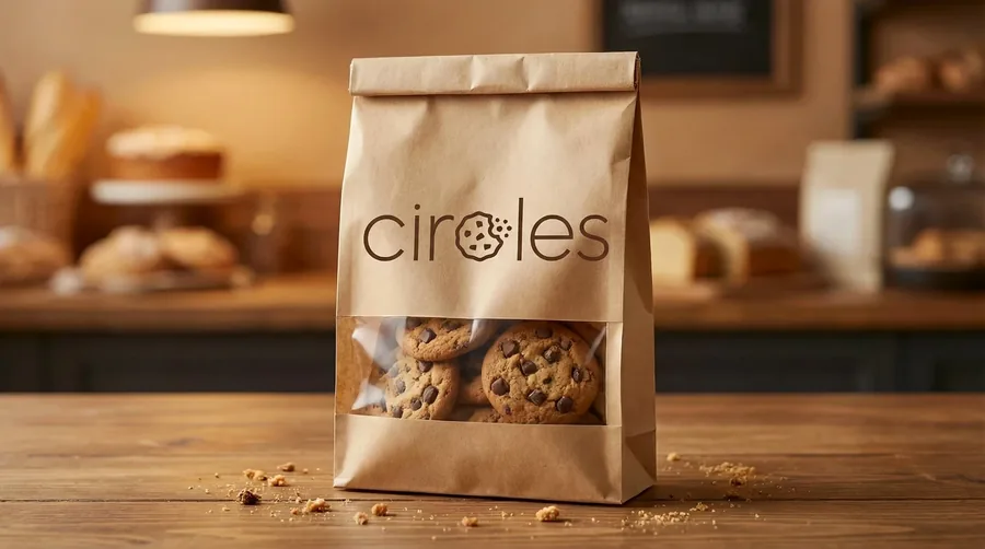
  • Kraft window bags for cookies and baked goods
  • Designs that work with standard bakery packaging formats
Croissant in a white pastry bag with the Circles bitten-circle mark in copper foilKraft paper cookie bag with a window and the Circles cookie wordmark
04

Signage & Interior Branding

We took the logo onto the street and into the café, so the brand is as recognisable from across the road as it is at the counter.

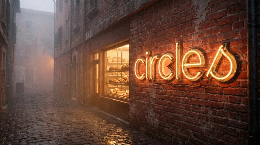
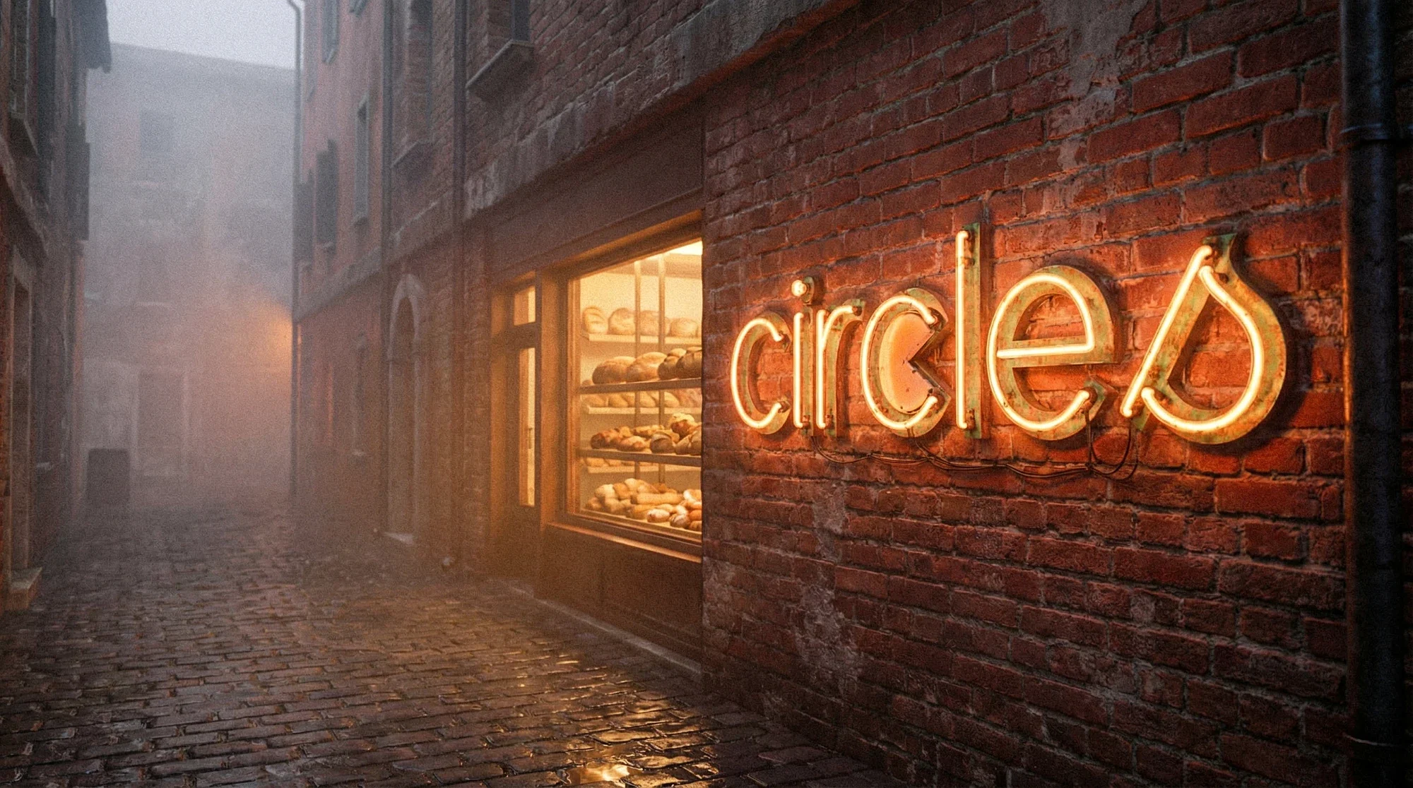
  • Neon shopfront sign that glows warmly at night
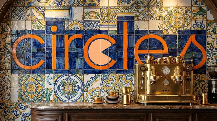
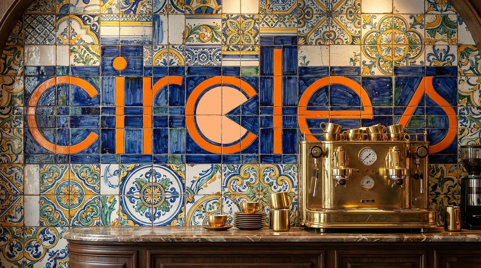
  • A statement tile mural spelling out Circles behind the coffee bar
  • Guidance for using the logo on walls, windows and menus
Circles neon sign on a brick shopfront beside a bakery window at duskCircles logo set in an orange and blue tile mural behind a gold espresso machine
05

Uniforms & Brand Guidelines

A brand is only as strong as its consistency. We applied the identity to team uniforms and documented everything in clear brand guidelines.

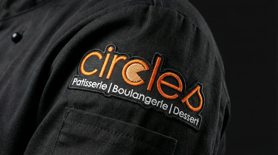
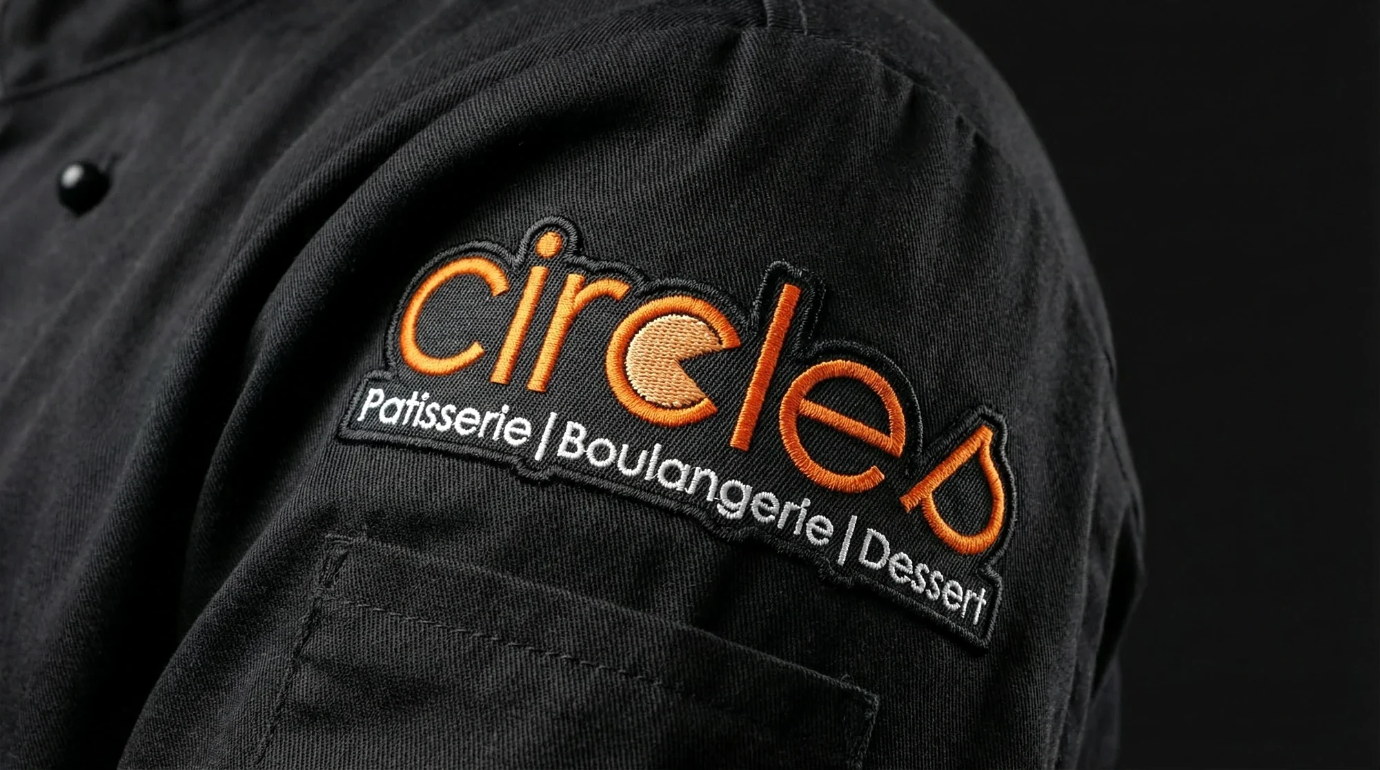
  • Embroidered logo patch for chef jackets
  • Brand identity board summarising logo, colours, type and applications
  • Simple rules for staff, printers and sign makers
Embroidered Circles logo patch on a black chef jacket sleeve
The work

The Circles brand in the real world

From the counter to the street. Select any image to view it in full resolution.

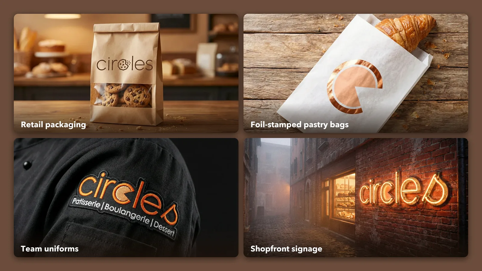
Circles brand touchpoints: kraft cookie bag, copper-foil pastry bag, embroidered chef uniform and neon shopfront sign
One identity across packaging, uniforms and signage.
What we delivered

A complete bakery brand, ready to open the doors

1

Distinctive wordmark with a bitten-circle “c” and a standalone icon.

4

Brand colours with HEX, RGB and CMYK values for screen and print.

3

Weights of the Minigap typeface: light, regular and bold.

2

Packaging designs: copper-foil pastry bags and kraft cookie bags.

2

Signage concepts: neon shopfront sign and tile mural interior.

1

Brand guidelines board so the identity stays consistent.

How we worked

From first idea to opening day

01

Discovery

We learned about Circles’ bakes, customers and competitors on the UK high street.

02

Concept & logo

We explored directions and refined the bitten-circle idea into the final wordmark and icon.

03

Brand system

We defined the colour palette, typography and rules for using the logo.

04

Applications

We applied the brand to packaging, uniforms, signage and interiors, and documented it all.

Get a free quote

Opening a bakery, café or restaurant?

Tell us about your business and we will come back to you with ideas, a timeline and a quote for your brand.

  • Logo and visual identity design
  • Packaging, menus and labels
  • Shopfront signage and interior graphics
  • Brand guidelines for your team

    Services you're interested in (select all that apply)

    Thank you! 🎉

    Your enquiry is on its way. Our team will be in touch shortly.

    Questions

    Frequently asked questions

    What branding services did Mavens Strategies provide for Circles?

    We created the complete Circles brand identity: logo and brand mark, colour palette, Minigap typography, packaging design, neon shopfront signage, a tile mural interior concept, embroidered uniform patches and brand guidelines.

    What does bakery branding include?

    Bakery branding usually covers the logo, colours and fonts, plus how they are applied to packaging, labels, menus, signage, uniforms, social media and the website. Brand guidelines then keep everything consistent as the business grows.

    Do you design brands for bakeries and cafés in the UK?

    Yes. We design brand identities for bakeries, patisseries, cafés and restaurants in the UK, as well as in the UAE, Saudi Arabia and the USA. We work remotely, so location is never a barrier.

    How long does a bakery branding project take?

    It depends on the scope. A logo and core brand system usually takes a few weeks, while full packaging, signage and interior applications take longer. We agree a clear timeline before starting.

    Can you design packaging and signage as well as the logo?

    Yes. We design pastry bags, boxes, labels, menus, shopfront signs and interior graphics, and prepare print-ready files for your suppliers.

    Your project

    Ready to give your food business a brand people remember?

    From logo to packaging and signage, we design brands for bakeries, cafés and restaurants in the UK, the UAE and beyond.